Fall 26 Alexa Updates - Components
Button
config="icon-only"
config="icon-with-bg"
config="bg-only"
mirror
fullSquircle
size="small" · 70px
size="medium" · 84px
size="large" · 100px
theme="alexa"
theme="kids"
theme="ftv"
theme="kindle"
theme="blink"
selectable · click it selected = false
selectable · starts selected selected = true
overflow="wrap" · length 260
wrap · maxLines 2
overflow="shrink"
overflow="expand"
Tile
product · small · 300×300
product · medium · 340×340
product · mirror
product · no bubbleImage
product-extended · small · 604×250
product-extended · medium · 725×300
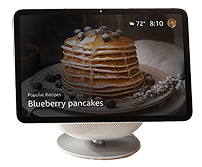
hero · small · 430×300
hero · medium · mirror · cutoutImage
- 
-
LookupTile
primaryText only
+ secondaryText
theme="kids"
theme="kindle"
Carousel
size="small" · 6 tiles · paged
3 tiles · no controls, centred
CompareCard
A 194px-wide product card whose height hugs its content. colors draws the swatch row — leave it out and the row goes entirely. Passing an array
for image pairs one image to each swatch, so picking a colour
swaps the shot.
image · productName · colors · description 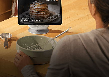
Lorem Ipsum Dolor Set Amet
Maecenas ut imperdiet sem.
no colors · swatch row drops
Lorem Ipsum Dolor Set Amet
Maecenas ut imperdiet sem.
3 images · 2 colors · third falls back
Lorem Ipsum Dolor Set Amet
Maecenas ut imperdiet sem.